
Summary
In my thesis, I study Amiga ASCII text art. Amiga ASCII is a form of text art where the composition of letter characters set in the Amiga computer's font forms a two-dimensional representation or image. The Amiga scene is a subculture of computer enthusiasts that was popular in the 1990s. At its core are the logos and other visual materials created for BBS systems and the competitive rivalry among artists who create text art over their image-making prowess.
I delve into the creation of Amiga ASCII art and use it as a method to develop my visual expression. I define text art as one style of visual art, which includes ASCII art and its sub-genres, and I briefly describe the history of text art and ASCII art and the subculture associated with it. In my thesis, I focus especially on Amiga ASCII text art and create a collection of images from my experiments with this image-making method.
Keywords: text art, computer, subculture, illustration, ASCII, Amiga.
Note from 2023:
This is my BA thesis I wrote in 2015. The original is in Finnish, but I finally managed to translate it to English.
This thesis is just a bachelors thesis, so it's far from being comprehensive. But as far as I know, it's still the only study of Amiga ASCII art. I have included some comments here and there from my 2023 perspective where I thought it needed them.
If you have any comments, corrections or other thoughs, let me know (hlotvonen@gmail.com) and I'll include them at the end of this page!
If you just want to see the end result, skip to Making the colly
Enjoy :-)
EDIT: Thanks to Michael Walden and goto80 for some edits and corrections!
Table of Contents
Research section
… 2.1. Source materials and research data
… 2.2. About text art
… … 2.2.1. Definition of text art
… … 2.2.2. History of text art
… 2.3. The age of ASCII art
… … 2.3.1. History of home computers
… … 2.3.2. What is ASCII art?
… … 2.3.3. What is Amiga ASCII art?
… … 2.3.4. The golden age of Amiga ASCII
… … 2.3.5. ASCII art to decorate BBS boards
… … 2.3.6. What is a colly?
Production part
… 3.1. My starting point for creating ASCII art
… … 3.1.1. Finding the right method
… 3.2. Production process
… … 3.2.1. Description of creating Amiga ASCII images
… … 3.2.2. Making the colly
… … 3.2.3. Physical final product
Sources
… 5.1. Printed sources
… 5.2. Unprinted sources
… … 5.2.1 Internet sources
… … 5.2.2. Documentaries
… … 5.2.3. Interviews
… 5.3. Image sources
INTRODUCTION
Colon, hyphen, and parenthesis are typographic punctuation marks used in written language that serve as separators for various text structures. By combining these three symbols in sequence, you get :-). When you tilt this combination ninety degrees clockwise in your mind, it can be interpreted as a smiling face, an emoticon, with eyes, nose, and mouth. Originally, these symbols were created for the structures of written language, but in daily human communication, these symbols and their combinations have been given a new added meaning and purpose. Images created with letter characters enhance the expressiveness of text-based presentations, such as emails or text messages.
In text-based communication, the representation of images has not always been possible for technical reasons. To address this need, text art emerged, a technique of creating images where a picture or word is formed from drawn or printed symbols in a composition. An emoticon is a kind of simple image formed with letter characters. However, by combining various letter characters spread over several lines, it's possible to create much more nuanced images that can depict almost any subject. This image-making technique has been a part of the history of writing up to the present day. I will discuss this matter in more detail in section 2.2.2.
Text art made on a computer is usually called ASCII art. The name derives from the character standard developed in the 1960s. ASCII art flourished in the 1980s and 1990s, before widespread public access to the internet, when text-based BBS systems operating on telephone networks served as the primary places for thought and information exchange, much like the internet. The making of ASCII art waned as the internet displaced BBS systems with the advent of fast broadband connections around the year 2000. However, ASCII art has surged in recent years due to nostalgia, social media, and the archiving of ASCII art.
In my thesis, I delve into this image-making technique and use it as a method to develop my visual expression. In the research sections, I define text art as one genre of visual art, encompassing ASCII art and its sub-genres, and briefly describe the history of text art and ASCII art and the associated subculture. I focus especially on the Amiga-style ASCII text art in my thesis and create a collection of my experiments using this image-making method. I elaborate on the aforementioned concepts in section 2.3.
RESEARCH SECTION
2.1. SOURCE MATERIALS AND RESEARCH DATA
Historically, the typewriter as a medium of creative expression has largely been overlooked, perhaps because those who created typewriter art were primarily professional typists who demonstrated their skills mainly to peers in the same field. Many early typewriter artists were likely unaware of the historical background and significance of their art, leading to a lack of its widespread recognition and acceptance by critics. Those who were interested in the typewriter as a medium for text art were mainly intrigued by it from the perspective of concrete poetry, rather than viewing it from a visual art perspective. This has resulted in a lack of complete understanding of the entire field of text art. Only now, due to the archiving capabilities of the Internet and the exposure of text art, is a more comprehensive picture emerging.[1]
This same trend seems to be occurring with ASCII text art, leading to a perceived lack of quality source material on text art or ASCII art. Two anthologies have been written on typewriter art: Alan Riddell's Typewriter Art (1975) and Barrie Tullett's Typewriter Art: A Modern Anthology (2014). Only one significant retrospective has been held on typewriter art (London and Edinburgh 1973, 1974)[2]. Not a single extensive publication or study has been written on ASCII art, and only one small exhibition was held in Cologne in 2013 as part of an electronic art festival. The subject has been briefly touched upon in a few studies dealing with computer enthusiast subcultures, such as the 2011 study Like City Lights, Receding: ANSi Artwork and the Digital Underground, 1985-2000 by Canadian Michael Hargadon. Most studies focus on computer enthusiast subcultures and related phenomena mainly from a technical, sociological, or historical perspective.
For my research, I interviewed two individuals who are still actively involved in the Amiga ASCII scene. I interviewed Amiga ASCII pioneer, German Michael "Skin" Hischer, via email. Additionally, I interviewed Finnish Amiga ASCII artist Antti "h7" Kiuru. The interviews mainly focused on questions about the process of creating ASCII art, their style, sources of inspiration, and personal history. I also posed a few general questions in the Facebook group "Ansi, Ascii artists worldwide!" which includes a large portion of individuals involved in the subculture.
As written sources, I utilized several studies dealing with computer enthusiast subcultures and related phenomena, numerous internet sources, and Barrie Tullett's work on typewriter art, Typewriter Art: A Modern Anthology. From these pieces, I believe I was able to create a comprehensive yet source-critical understanding and description of the subject matter under investigation.
2.2. ABOUT TEXT ART
2.2.1. DEFINITION OF TEXT ART
While working on this thesis, there didn't seem to be a definition of text art available anywhere. This is probably due to the almost complete absence of both Finnish and English literature or research on text art. Just the fact that the English Wikipedia article for "text art"[3] redirects to a vague and sparse article on ASCII art indicates the scarcity of research and that the history of text art has not been fully understood internationally. However, to address my research topic, I need to define text art in some way.
Note from 2023:
Anders Carlsson goes over a critical overview of (some) genres of text art in his paper Beyond Encoding: A Critical Look at the Terminology of Text Graphics in WiderScreen (June 15, 2017).
When I started to develop a definition of text art, the difference in the use of a letter character in written language and in text art seemed to be a defining factor. What is the significance of a letter in text art? What's the difference between a letter character in written language and in text art?
Text is a semantic unit. In text, the form isn't as important as the meaning given by the forms[4]. Written text consists of graphemes, i.e., written characters. Grapheme refers to letters, that is, characters used in a phonetic writing system, and other writable characters such as numbers and punctuation marks[5]. In written language, text and letters contain meanings; they are a tool for communication.
In the context of text art, a character is considered solely through its form. In text art, a letter is not symbolic and does not have semantic meaning, but the composition of letter characters creates an image, which in itself can symbolize something. The semantic meaning of the image arises from the form given by the composition of the letter characters, that is, what the image resembles, unlike in written language where combinations of letter characters, words, and sentences mean something, carry meaning. Thus, one can think that the word "ball" immediately brings to mind an object made of some material, while in the context of text art, a ball can be symbolized by, for example, the letter O, in which case just the shape of the letter can bring to mind an object made of material.
Text art can therefore be defined as follows: text art is a form of art in which a composition of letter characters forms a two-dimensional representation, that is, an image.
Note from 2023:
This definition is not satisfactory.
First of all, there are forms of text art where characters can be both: semantic (where the character is a part of a word) and non-semantic (where the same character is part of an typographical picture) meanings. This is quite common in shaped or visual poetry.
Secondly — where the attempt at a universal definition of text art gets really complicated — it's possible that the whole picture consists of no letters at all. An example is of course ANSI art, where the pictures usually consist of only block elements █, ▓, ▒, and ░.
A possible, more broad, but also more straightforward, definition of text art could be: pictorial images created from type elements. (I don't suggest that to be the definitive definition, because it doesn't quite capture the essence of more calligraphic forms of text art.)
Broadly, text art can be divided into 3 categories: calligraphic, mechanical and digital.
Calligraphic text is hand drawn, it includes but is not limited to these sub-genres: calligrammes, calligraphic pictures, zoomorphic calligraphy, various shaped or pattern poetry (carmina figurata, grid poem, imago poem, spatial line poem), micro-calligraphy (or microgrammy), some asemic writing and pictorial islamic calligraphy.
Mechanical text art is usually done with either letterpress or typewriter. That includes subgenres such as: type pictures / typipictures (US), art-printing, letter-pictures, pictorial typography, ruled paintings / picture, imagotipo/imagotipia (Venezuela), Koppermandaag prenten (The Netherlands), Bildsatz, Ornamententypensatz, Typensatz (Germany), Stigmatypie (Austria), stigmatypy (US), typometry / typometrie, typotecture and typewriter art (including concerte poetry and other visual poetry).
Digital text art includes various textmode art such as 7-bit and 8-bit ASCII art, PETSCII, ATASCII, PC-ASCII (filled ASCII), ANSI art, Amiga ASCII, Shift_JIS, Unicode art, Taiwanese ANSI and others. Non-textmode text art includes newer and more varied styles, but they are too numerous to include here. Check Carlsson's overview and Polyduck's What is Textmode? for more.
(I should write a more comprehensive overview especially of the mechanical ones at some point...)
2.2.2. HISTORY OF TEXT ART
Before the invention of typewriters and computers, calligram was the most common form of text art. A calligram is a poem, phrase, or word in which the text or words are arranged so that they collectively form a picture. The picture formed in the calligram is usually visually related to the words or word used in it and expresses the theme of the poem. One of the first calligrams is Axe by Simmias of Rhodes, made in 325 BC, where the text forms an image of an axe (Figure 2). A Jewish tradition of micro-calligraphy also resembles calligrams, where small written Hebrew letters form geometric and abstract images[6].

Arabic calligraphy can also be considered a form of text art. Drawing humans is seen in Islam as idol worship, so pictures were drawn using calligraphy, that is, text. In Islamic culture, calligraphy is considered the noblest form of visual art, as it translates the words of God as revealed in the Qur'an into a visible form. Qur'anic manuscripts have always been commissioned from the most skilled calligraphers to give the text an artistic appearance worthy of its value [7].
Movable type and printing press developed in the 1400s made duplicating knowledge fast and, above all, cheap. The printing technique made it possible to shape people's perceptions of themselves and the surrounding world. The great revolution of printing in Europe was the invention of movable type, which meant that the same type could be used over and over again to produce many different printed products. Movable types significantly accelerated page production compared to engraving each page separately on wood or metal plates, so movable types were also used to create typographic ornaments and pictures [8].
Note from 2023:
This is my current focus of study and I hope to write more about the history of pictorial typography with movable type soon™!
Just as the printing press once did, the typewriter revolutionized the world. By the end of the 1800s, it had established its position not only in the industrial and commercial sectors but also in the cultural and social fields. Typewriter created new professions and livelihoods and was also a crucial step towards women's emancipation. It also gave people the means to communicate freely without fear of censorship and enabled writers to write as quickly as they thought. The typewriter brought a modern way of directly presenting and disseminating thoughts[9]. It also became a tool for making art.

One of the first surviving images made with a typewriter is a picture of a butterfly made by Flora Stacey, who worked as a secretary, in 1898[10] (Figure 3). By re-entering the same paper at different angles and stacking letters, almost any shape could be created, and Stacey's picture is more reminiscent of pencil drawing than typical mosaic-like text art. On the other hand, a few years earlier, the publication Pitman’s Typewriter Manual (1893) better utilized the limitations and possibilities set by the typewriter and is more reminiscent of modern ASCII art than Stacey's butterfly (Figure 4).

However, text art made with a typewriter can be seen to have flourished mainly in the 50s–70s. Around the same time in the 1950s, concrete poetry was born in different parts of the world, where the typewriter was used as a tool to create visual poems with the typographic layout of words being crucial to the impression. In concrete poetry, seeing and reading play an equally significant role[11]. Artists and poets who used this method were interested in how printed words can be interpreted through their presentation and design. They sought ways to create new meanings and conceptual levels for the text by visually composing it[12].
At the same time, written messages were transmitted over radio links using teletype machines. Using a sound reminiscent of Morse code, the machine could remotely control another similar teletype machine, with messages printed on paper through a printer. What was written on paper at one end was automatically written on paper at the other end. To standardize the character graphics for teletypes, the 5-bit Baudot code was developed, which can be considered a precursor to the ASCII character system. Text art created with teletype machines was exchanged among other radio amateurs, and these works are very reminiscent of future ASCII art [13] (Figure 5).

The development of different forms of text art does not seem to be linear but appears to have occurred independently following each paradigm shift in information technology. They are fascinating examples of how technology has been used as a tool to create works far from what the technology developers could have imagined they would create. The pioneers of text art seem to have been primarily those who were not primarily artistically oriented but were interested in technology and its limitations.
The first step in the emergence of computer-made text art, called ASCII art, occurred with the change in Western consumption paradigm brought about by the microcomputer revolution in the late 1970s. How did this paradigm shift occur, and what followed? What steps led to the birth of ASCII art? I will discuss these issues in the next chapter.
2.3. THE AGE OF ASCII ART
2.3.1. A HISTORY OF HOME COMPUTERS
At its core, computers are intricate calculators, adept at computing mathematical functions swiftly and processing vast amounts of data. Until the late '70s, these calculations and data processing were performed on large mainframes – the first-generation computers situated in glass-walled computer rooms. These were primarily used as instruments of centralized power within hierarchical organizations to manage large and complex commercial-administrative systems. This gave birth to an industry where IBM played a dominant role. These mainframes were only accessible to entities with significant capital, such as the defense industry, large corporations, and universities. Their operation required expertise in both hardware and software[14].
By the late '70s, foundational computer components, transistors, and microprocessors, had been miniaturized enough to allow for the creation of reasonably sized second-generation microcomputers. In essence, microcomputers did not differ from mainframes except in size, price, availability, and complexity[15].
However, the technology revolution didn't stem merely from technological achievements, but from the evolution of factories that produced components. As these components were miniaturized, their production costs reduced, and manufacturing energy efficiency and volumes increased. This allowed for mass production of computers. Yet, by the mid-'70s, a typical microcomputer user needed skills like soldering components, constructing keyboards, interfacing devices, and programming both the system and applications. Computers transitioned from computer rooms to design offices and labs, inadvertently giving rise to the hacker culture. A new wave of enterprises emerged in the IT sector, leading innovations and developing consumer-friendly applications and devices[16].
By the late '70s, new companies emerged that sold pre-assembled computers. Apple was one of these, with its Apple II in 1977 being the first massively successful mass-produced microcomputer. In a May 1977 article for Byte magazine, Apple's Steve Wozniak wrote,
“I think a personal computer should be small, reliable, convenient to use, and inexpensive”[17].
No longer did computer users need to be IT experts or hobbyists, but could simply be the "ordinary consumer".
The third generation, or personal computers, in the 1980s, transitioned IT from the hands of engineers to a broader user base who began applying it for tasks like word processing and spreadsheet calculations. By the '80s, the market had been flooded by several small, medium, and large companies offering various solutions. By 1983, however, the market was predominantly dominated by systems from three computer manufacturers: Apple Computer's Apple II, Commodore International's Commodore 64 (and later Amiga), and IBM's PC. Each catered to slightly different consumer bases based on price and technical features. Apple computers were mostly sold to users wanting a mix of games and utility programs, Commodore dominated the gaming market because of its affordability and superior graphics and sound capabilities, and IBM rapidly secured a monopoly in the corporate IT world.
In the 1980s competition, IBM established the dominant standard for personal computers (IBM PC-compatible computers), but lost its exclusive rights to manufacture machines following its standard. By the end of the '80s, 80% of all sold microcomputers were either IBM-made or at least used its system. However, by the early '90s, the mantle had shifted to the Intel-Microsoft duo, whose actions reshaped the entire industry. Intel was responsible for processors, and Microsoft took care of the operating system[18].
Still, Amigas were popular in the early '90s and became significant among computer enthusiasts. They were more prevalent in Europe than in America, which influenced the strong Amiga culture in Europe. For instance, according to a reader survey conducted by MikroBitti magazine, 49% of its Finnish readers owned an Amiga, while 27% owned a PC, at the turn of 1991–1992[19].
However, Amiga's share of the home computer market declined sharply in subsequent years as PCs overtook them in terms of price-to-quality ratio. Commodore couldn't counteract IBM PC's and its clones' rise with their Amiga. Though initially ahead in terms of value, by 1992, it became challenging to produce cost-competitive technology against the ballooning PC industry[20].
In May 1994, Commodore filed for voluntary bankruptcy. However, the unwavering loyalty of some Amiga users ensured that the Amiga hobby and scene continued, even if new devices were no longer sold. By the mid-'90s, PCs had become the standard home computer in Europe, with no serious challengers in sight.[21] Gradually, computers became a household item in Western countries.
Brushes and parchment, the printing press, teletype, and typewriters each enriched text-based communication in their time. Similarly, the most crucial factor of the computer revolution was the democratization of information as the computer became a consumer product[22]. In the following subsections, I will discuss the evolution of computer writing systems and the emergence of different forms of ASCII art with these devices and systems.
2.3.2. WHAT IS ASCII ART?
In the 1960s, to facilitate the transfer of text-form information across various systems and devices, the ASCII character set standard was developed (an acronym for American Standard Code for Information Interchange)[23]. In information technology, a character set is an agreement defining how binary numbers represented as bit combinations should be interpreted as characters belonging to a writing system. A computer can correctly process only those characters included in its known character set. ASCII is a 7-bit character set, covering 128 (2⁷) character positions, and primarily encompasses the letters, numbers, punctuation, and special characters, as well as certain control codes, required for American English[24].

Since computers typically use 8-bit bytes and ASCII is 7-bit, many computer manufacturers developed broader character sets where the spare bit was utilized. This doubled the number of characters from 128 to 256 (2⁸). In these character sets, the first 128 characters typically matched ASCII, but the remaining positions could be devoted, for example, to letters of other languages or characters reserved for table graphics. As a result, the extended character sets of different computer manufacturers could vary considerably[25].
Note from 2023:
Check VileR's The Ultimate Oldschool PC Font Pack for a very thorough collection of classic system fonts.
ASCII remained the most commonly used character set on the Internet until 2007 when it was overtaken by the UTF-8, based on the Unicode standard, comprising over 110,000 characters[26].
Artwork created with the ASCII character set is referred to as ASCII art. However, the term "ASCII art" has become an umbrella term for all types of images formed from computer-assisted characters. This is somewhat misleading, as ASCII refers to the original 7-bit, 128-character position character set. Most ASCII art, however, is crafted using extended 8-bit or higher character sets. The most renowned forms of ASCII art are 7-bit ASCII art, ANSI art, Amiga ASCII, ATASCII, PETSCII, Shift_JIS, teletext, and Unicode art. Each employs a distinct character set and often a specific font to craft the images[27].
Most ASCII art is crafted using a computer's text-based system (known as "textmode"), which consists of a grid built from identically sized cells. Each cell can contain one character. Characters employ a monospaced font, with each character occupying equal space, thus each row can contain an equal number of characters. The number of characters per row depends on the system and application in use. For instance, IBM PCs employed an 80x25 grid for displaying text, with a maximum of 25 rows, each having 80 cells. Current text processing predominantly supports variable-width fonts, which weren't viable in textmode. ASCII art made in textmode can thus be described as a kind of mosaic, where typographical symbols are precisely arranged on a grid to form an image[28].
One of the earliest images reminiscent of ASCII art was created by Kenneth Knowlton and Leon Harmon, both of whom worked at Bell Labs. The image was a mosaic of a nude, comprised of symbols used in electronic circuit diagrams[29]: (Figure 7).

"The nonscientific, some say artistic, aspects of computer graphics arose for me via a sophomoric prank. Ed David, two levels up, was away for while and the mice, one might say, played ever more freely. Leon Harmon stopped by to ask me for help with a brilliant idea: when Ed returns, one entire wall of his office will be covered with a huge picture made of small electronic symbols for transistors, resistors and such. But overall, they will form a somewhat-hard-to-see picture of, guess what, a nude! And so the renowned Harmon-Knowlton nude was conceived, coaxed into being, and duly hung on Ed's wall."[30].
Even though this image was swiftly removed from the office wall and rapidly dismissed by Bell Labs' PR department, it leaked to the public, ending up on the pages of The New York Times and even on display at the Museum of Modern Art in New York in an exhibition titled The Machine as Seen at the End of the Mechanical Age. This prank turned into a sensation in a short time, and the creation of this symbol-based mosaic was a crucial step in the evolution of computer graphics and ASCII art[31].
2.3.3. WHAT IS AMIGA ASCII ART?
ASCII art made with the Amiga computer's font and column settings is called Amiga ASCII.
The Amiga has its own 8-bit character set. The first 128 characters follow the ASCII standard, and the remaining 128 characters follow a supplemental Latin character set ISO/IEC 8859-1. It isn't particularly suited for drawing pictures and graphics, as it doesn't contain characters meant for drawing tables and graphics, unlike character sets of some other contemporary machines. Amiga's extended character set mainly contains some mathematical symbols and some characters of European languages, such as the letters ä, ö, and å used in Finnish.
Note from 2023:
As noted by Michael Walden, the Amiga character set is equal to "ISO/IEC 8859-1" and "ECMA-94 Latin Alphabet No. 1" except for one character at code point hex 7F. It's a strange glyph: a rectangle filled with diagonal black and white stripes. Normally the code point at 7F is DELETE. This character is rarely used in Amiga ASCII art, but can be used for some interesting effects. See recent example by h7 where this character is used for the beard and line under the logo.

What makes the Amiga particularly suitable for creating text art, however, is its default monospaced font "Topaz". Its letterforms and column settings allow for the creation of cohesive patterns. In Amiga, the line spacing and character spacing are very narrow, so certain characters "merge" if arranged correctly. For example, by typing an underscore followed immediately by a slash, it looks as if these two characters were one cohesive pattern and not two separate characters.
By combining these characters, it's possible to create pictures resembling sketches or outline drawings. This is a special feature of Amiga ASCII, distinguishing it from all other forms of ASCII art. Amiga ASCII is also called line-ASCII to differentiate it from filled-ASCII made on PCs.
Slashes and underscores are perhaps the most commonly used characters in Amiga ASCII art. These characters form the basis of many Amiga ASCII pictures. Two slashes placed one below the other form a cohesive slanting line, and two underscores in a row form a straight horizontal line. These characters can form an endless variety of shapes, which almost seamlessly connect to each other. Due to the cohesive line formed by the slash, many Amiga ASCII logos look italic or slanted.[32]

Michael Hischer, whom I interviewed, describes his technique as:
"[The limited number of characters] has always been an opportunity and challenge for me to create something that others don't do or can't do. I never use more than ten characters when creating ASCII. An excessive number of characters would be a distraction and divert from the essentials." [33] (Figure 10)

Amiga ASCII is part of a broader phenomenon called the demoscene. The demoscene is a computer hobbyist subculture centered around its cultural artifacts, demos. Demos are real-time audiovisual presentations executed on a computer, made especially within the demo culture, or demoscene, that emerged around the mid-1980s.[34] The Amiga scene, on the other hand, is a subculture of the demoscene, centered on logos and other visual materials made for BBS usage and the competitive skill of text artists.[35]
In 2018 I wrote an essay ASCII art: From a Commodity Into an Obscurity that talks more about the subculture and the question "Why does ASCII art exist?"
Amiga ASCII art can be seen as a continuation of PETSCII art made on Commodore's earlier Commodore 64 computer. PETSCII refers to the character set of the Commodore 64, which was well-suited for text art. The technologically advanced Amiga, however, replaced the Commodore 64, and many PETSCII artists began to create text art on Amiga computers. However, the popularity of Amiga ASCII art is mainly based on the culture and social communities formed around BBS[36]. For this reason, I will mainly focus on discussing Amiga ASCII during the BBS era, leaving out the similarities of PETSCII art to Amiga ASCII.
Nowdays Amiga ASCII is mostly created on PC, Mac or Linux computers. The only defining factor for Amiga ASCII art today seems to be the method of creating the image using the Amiga font.
2.3.4. THE GOLDEN AGE OF AMIGA ASCII
A BBS (Bulletin Board System) refers to a computer connected to the landline network through a modem, to which its users, or BBS enthusiasts, connected with their own computer. The main focus of BBSs was primarily on various discussion areas and file sharing. Many BBSs formed tight-knit user communities and served as meeting places for various groups. BBSs can be thought of as precursors to many features familiar from today's Internet, such as social communities.[37]
The origin of BBSs began when Ward Christensen and Randy Suess (US) developed the MODEM program in 1978 mainly for data exchange within their computer club. With it, two computers could communicate and exchange files. Later that year, Christensen and Suess developed the system known as the world's first BBS called CBBS (Computer Bulletin Board System)[38].

Connections to the BBS were made using a modem connected to the landline network, using a character-based terminal program. Connecting cost the same as making a regular phone call. International connections were thus possible, though expensive. After calling the BBS, the user had to log into the system first. Most often, real names and sometimes also pseudonyms or handles were used in BBSs. In addition, during registration, users were often asked for name and address information and sometimes also for certain data communication settings.[39]
BBSs were navigated using keyboard commands in various menus. There were several different menu levels, usually varying according to the software the BBS used. Typically, BBSs included discussion areas, file areas, private messages, bulletins, and in some systems, it was also possible to play text-based games or chat in real-time with other users and the BBS administrator. File exchange was a significant part of BBSs, as uploading files earned usage time in the BBS.[40]
BBS activities remained for a long time within a small group interested in data communication and microcomputers. Gradually, as modem speeds increased towards the end of the 1980s, it began to spread to the awareness of larger user groups. What started primarily to facilitate mutual information exchange began to form a subculture. The age and user structure began to change, and at the same time, the ways BBSs were used diversified significantly. In the 90s, the subculture was mainly composed of young men aged 15-20. They shared an interest in computers and the possibilities they created[41]. BBSs were significant communal forums for social activity. They served as meeting places for friend groups as well as hobbyist and subcultural groups[42].
Due to the home computers on the market that were incompatible with each other, hobbyists were loosely divided into different user groups specific to each computer. It was possible to log into BBSs with any computer, but due to the different character set standards, they might not necessarily display or function correctly. As a result, Amiga and MS-DOS-based PCs developed slightly different user cultures, even if their basic vibe was the same[43].
2.3.5. ASCII ART TO DECORATE BBS BOARDS
Data transfer via modem was very slow and therefore consisted mainly of text files. Terminal programs used to connect to the BBSs also operated under text-based operating systems. Due to their text-based nature, the BBS user interfaces were quite austere. There arose a need to embellish these interfaces and create images.
Amiga and PC-based BBSs started to be decorated with ASCII graphics. Most of the BBSs operated on PCs, which were not compatible with Amiga (Figure 12). Graphics on the PC were created using the extended character set and font of the original IBM PC, known as ANSI art.

ANSI art is a form of ASCII art. However, it significantly differs from other forms of ASCII art, as ANSI art mainly consists of rectangular raster bars and looks more like pixel graphics than actual text art. PC computers' ROM (read only memory) contained the character set and font specified on "code page 437". This character set includes the 128 characters of the ASCII standard and additionally a set of graphical elements specifically for drawing tables and graphics. However, ANSI images are primarily composed of five characters, whose different strength raster surfaces enable the creation of color fields and shading on an 80x25 grid. Using color was also possible through terminal control codes included in the ANSI X3.64 terminal control standard. The ANSI color palette consists of 16 colors and 8 background colors, which was later expanded to 16 colors and 16 background colors by reusing some bits for more colors. This allowed for significantly more imposing images than traditional ASCII graphics.[44]
Note from 2023:
Because the tools for creating ANSI and Amiga ASCII are mostly the same, many contemporary Amiga ASCII pieces also use ANSI colours. However, if the Amiga ASCII is using iCE colors, the file wouldn't display correctly in many Amiga ASCII viewers and editors. For example the escape sequence "Esc[1m" turns on bold text on Amiga, but the same escape code turns the foreground text a bright light blue color using iCE colors.
On the other hand, AmigaOS has a wide range of supported colors and different ANSI escape sequences, which would theoretically allow one to display more colors than the PC ANSIs. Some escape sequence commands can be also used for all kinds of funny trickery, like moving the cursor and erasing parts of lines. This made it possible to create pixel art with text files, and has lead to a lot of confusion among the ASCII art community.

Even though Amiga ASCII could potentially be more colorful and diverse in form than the PC ANSI, for some reason most Amiga ASCII art in the archives is just plain text in monochrome.
Thanks to goto80 and by proxy sir garbagetruck for pointing this out.
ANSI graphics were originally used in crack intros[45] for illegal software copies and in the logos of BBS login pages. Before long, ANSI artists formed groups and began publishing monthly packages containing ANSI art. Activities were typically organized, and intergroup competition became an essential factor in maintaining the intensity of the hobby.
A few comprehensive studies and other literature have been written on ANSI art and its related culture, so I will omit its in-depth discussion from this thesis.
Amiga ASCII was largely created for applications related to BBS boards. BBS administrators needed beautiful login pages and ASCII art to embellish various sections of the BBS to improve the user interface.
In the early 1990s, Amiga ASCII art groups and individuals began to release their materials as collies or logo collections. This convention can be seen as having come from the ANSI art side, where groups published their works in art packs. However, Amiga ASCII collies were individual text files containing all the material, while ANSI art packs were collections of separate files.
Today, BBS boards have no practical significance and exist mostly for nostalgic purposes. They can also be a status symbol for groups and a way to pass the time. However, various websites on the Internet have replaced the BBSs as the publication channel for collies[46].
2.3.6. WHAT IS A COLLY?
Colly, or collection, is a text file containing a collection of Amiga ASCII artworks created by one or more artists. The primary purpose of collies is to showcase the latest works of an ASCII artist in one place.
The term "colly" originated from the Amiga ASCII group ART's 1992 released logo collection called Collection volume 1 [47], after which it became a common practice within the subculture. Collies were the primary publishing format for Amiga ASCII art and have remained so to this day.
Rarely was Amiga ASCII used for traditional, representational art. However, representational images might be used in collies as illustrations. The main content of collies was typographic logos. They were usually made to a maximum size of 80x25, as the terminal programs used to connect to BBS were this size. Logos were typically 7-12 letters long, depending on the width of the logo font. The letters of a logo were often adjusted according to the length of the word and its intended use. The same logo style could be applied to words of different lengths. Even four-letter logos could be stretched to 80 cells to suit its use in BBS. Often, ornaments or texturing were made around the logo to frame the logo itself[48].
Some collies were collections of miscellaneous logos, advertisements, and other materials used in BBS made by the artist. However, many collies showcased the artist's newly developed typographic style to make logos. Collies could also be made in collaboration with another artist. Then both artists would create their own version of a particular word, and the person who commissioned the word could choose which one to use[49]. Collies were often thousands of lines long.
Artists releasing collies competed with other artists for the best colly. An individual or group that made a beautiful colly gained respect and status among members of the subculture. Makers of high-quality ASCII art could also ascend within the group's internal hierarchy or receive invitations to generally more esteemed groups. As in other computer enthusiast subcultures, competition among groups and their members was a key factor in motivating groups to publish and maintain the quality of collections.
A colly traditionally consists of the following elements:
A. Advertisement for the group's own BBS
B. Title of the colly, creator's logo, and group logo
C. Table of contents (index)
D. Introduction / creator comments
E. The actual content of the collection, i.e., ASCII logos, BBS advertisements, and file_id.diz files
F. Credits
G. Greetings (greets)
H. Acknowledgements (respects)
A. Advertisement for the group's own BBS
Collies usually begin with either an advertisement for their own BBS or a title. The BBS advertisement promotes the group's own headquarters (HQ) BBS. The headquarters serve as the group's primary publication channel for new collies, the place where the group's productions arrive the fastest[50].

In the ad, the name of the BBS is made as an ASCII image, and details about the BBS are listed around it. This information usually includes which groups it serves as the headquarters for, the names of the BBS administrators, technical details, software, and addresses used for connection. Only those with a functional BBS use a BBS advertisement. (Figure 13).
BBS advertisements were also made for BBSs other than the group's own. These ads could be spread on discussion areas reserved for ads in other BBSs. The more impressive the ad and the more famous the artist who made it, the more people it attracted to visit the advertised BBS[51].
B. Title of the colly, creator's logo, and group logo
At the beginning of collies, there is usually a title. The title may include the name of the colly creator, the name of the group the creator belongs to, and the name of the collection. The title is important because it reflects the theme and style of the collection and gives a taste of what's to come. It serves as an introduction to the following sections. (Figure 15).

C. Table of contents (index)
The table of contents lists the ASCII images contained in the collection in numerical order. In the list, names are usually written in plain text. Tables of contents are used especially in long collies, which may contain hundreds of logos and other ASCII images made for various parties.
D. Introduction / creator comments
Collies often also contain a brief introduction, where the creator writes about the origin or theme of the collection, their own life, news, or other matters related to the subculture. This allows the creator to explain the background of their colly, express their thoughts related to drawing, or reinforce their position as an Amiga ASCII creator. (Figure 14).

E. The actual content of the collection, i.e., ASCII logos, BBS advertisements, and FILE_ID.DIZ files
The main content of collies consists of ASCII logos made for others, BBS advertisements, and file_id.diz text files. These usually come as requests from other members of the subculture. For example, a BBS administrator might ask an Amiga ASCII artist to create a login page logo for their BBS. Then the creator of the colly can use their newly developed style to create a logo for the BBS administrator to use. So, ASCII logos were often put to some use. ASCII logos could be requested by anyone, individuals, or groups.
FILE_ID.DIZ is an ASCII text file that contains a short description of the content of the archive file. Many BBSs allowed users to upload their own files for others to download. BBS administrators might require the person uploading a file to also provide a description of the content they are uploading. To standardize descriptions, archive files were supplemented with a FILE_ID.DIZ file to provide a clear description of the content to be downloaded. The text file was required to contain at least the program name, version number, and a description of the file to be downloaded. Traditionally, FILE_ID.DIZ was allowed to be 10 lines long, with each line containing a maximum of 45 characters[52].

However, Amiga ASCII artists began to use this file for their own needs, often as an icon for the colly. In this case, FILE_ID.DIZ contains the name of the colly, the creator, and some release information. The purpose of the icon is to be as impressive as possible to attract the attention of others, as it serves as a preview for the actual colly.
Different logos are separated by a separator. The separator also structures the content and helps with navigation. The separator usually lists the logo number, which matches the table of contents, the name of the colly, the name of the logo, and/or the name of the person requesting the logo. Because logos are often difficult to read, the text of the logo in the separator is often written in plain text.
Amiga ASCII logos always have the artist's own abbreviation attached, indicating the creator and copyright. The worst violation is to steal someone else's style or logo and claim it as one's own. If caught, the punishment could be exclusion from the subculture[53].
F. Credits
Credits provide the closing details for the colly. It lists the creator's name (or names) and possible guest appearances, i.e., if another Amiga ASCII artist participated in the creation of the colly. The credits often state the release date, file size, file name, font used, text editor or other technical details. Often the credits also mention what music the creator listened to while creating the colly.
G. Greetings
Greetings, or greets, list the creator's personal acquaintances.
H. Acknowledgments (respects)
In acknowledgments, or respects, Amiga ASCII artists who are admired and respected by the creator are listed, even if they are not personally known.
Greetings and acknowledgments were once important for increasing visibility. In listings called ASCII charts, Amiga ASCII artists were ranked by popularity using various metrics. Amiga ASCII artists could be publicly voted on, or the greetings and acknowledgments included in collies were counted together, measuring the artist's popularity. Those who received the most greetings and acknowledgments from other artists topped the list, in turn increasing their popularity and visibility of their collies. Rankings also took into account for whom other artists had made logos. This partly motivated designing logos for other ASCII artists[54].
The largest archive site for Amiga ASCII collies, asciiarena.com[55], lists about 4,000 collies from 780 different artists spanning the years 1992-2015. Most of them were released before the year 2000. While Amiga ASCII might be considered a niche subculture, the number of artworks and artists indicates a significant phenomenon.
Note from 2023:
Asciiarena.com is nowdays asciiarena.se, but unfortunately it seems to be down every once in a while. Archives containing all the released collys from 1992–2015 can be found on github
PRODUCTION PART
3.1. MY STARTING POINT FOR CREATING ASCII ART
I didn't get to witness the golden days of BBSs and ASCII art or belong to the ASCII art-related subculture because the subculture had already waned by the time I started my computer hobbies in the early 2000s. However, I remember what the Internet was like in the late 90s and early 2000s. It was a magical and mysterious place for me, where every now and then, I'd encounter these strange images made up of mere characters. These could be seen in text-based info files of downloaded files, comments on discussion boards, or hidden in a website's source code. These images intrigued me, and at about ten years old, I too wanted to master this art of image-making: slowly, one letter at a time, I typed an image of a DJ playing records. The technique was challenging and time-consuming enough that I tried it only once.
In January 2014, I found a web-based hobby magazine on the internet, OrDeR Of ThE ShAdOw Wolf, a cyberzine, made by the Dutch electronic music-producing artist Danny "Legowelt" Wolfers. For a moment, the internet felt magical and mysterious again, as I read text laid out in green monospaced font on a black background, with titles and images made in ASCII.
Legowelt starts the cyberzine with these words:
"Welcome to the first issue of ORDER OF THE SHADOW WOLF, a cyberpunk e-zine in true original text format. This is how e-zines looked before the dawn of the internet in the 1980s and early 1990s. They were distributed via BBS's [...]. People would download these e-zines on their 300 baud modems and read them on their monochrome green screens late at night. Difficult to imagine now but doing this felt like the most exciting thing in the world, surrounded by a mystique of hacker romanticism and being a cyberpunk pioneer. It was a time when your mum and retarded jock cousin weren't on the internet, even more hardcore...you were probably the only person in your whole town or area logged into cyberspace!" [56]
I wanted to delve into this obscure subculture and the way of making images. It felt fascinating. I also don't believe I'm very skilled in illustrating, designing logos, or producing visual material in general. I wanted to enhance my creative expression. After trying to draw my first ASCII image, I found that making logos and images with the constraints set by ASCII is quite liberating. The limitation of the ASCII character set forces creativity and uses it as a strength for making images. The primitive nature of this medium felt like the right method to develop my expression.
I set the following goals for myself before embarking on the project:
"I intend to try various styles and techniques to draw logos with ASCII. Initially, at least, I will use the word "GRMMXI" as the text for my logos, which represents my friends/classmates/artistic community for whom, and to whom, I'm creating these logos. This will keep me motivated. Through experimentation, I aim to observe shapes, typography, logos, and textures in a new light, thereby evolving as a graphic designer. I also haven't done much logo design before, so I hope this approach brings new perspectives to logo design."
3.1.1. FINDING THE RIGHT METHOD
I work as a web designer, so I started working on my first experiments with the text editing tool I know best: a code editor. However, I soon realized that with the default font of the code editor, I couldn't produce results that met my expectations: the characters didn't mesh well together. I wanted to know how ASCII art is really made.

While getting acquainted with ASCII art, I wasn't yet aware of the existence of Amiga ASCII. From the site sixteen-colors.net[57], which archives ASCII and ANSI art, I found the logo of the Break group (Figure 17). I had never seen ASCII graphics of this style before, where the lines connect almost seamlessly. I wanted to make my thesis using this technique and began to delve into the technical characteristics of this style.
In my search, I found the website asciiarena.com, which archives Amiga ASCII collies. It is the most comprehensive site archiving Amiga ASCII and now serves as the primary publishing channel for new Amiga ASCII works for many. The site is full of increasingly impressive Amiga ASCII collies, and browsing through the works of others served as a significant source of inspiration throughout the project. I decided that I wanted to publish my project on this site in its original colly format.
I found and installed the original Amiga fonts[58] in TTF format on my computer. This allowed me to start creating Amiga ASCII images and delve deeper into the method of making ASCII images. I set my text editor's user settings to use the Amiga Topaz font, reduced the line height, and changed the colors to black and white. This allowed me to achieve the desired results.

3.2. PRODUCTION PROCESS
3.2.1. DESCRIPTION OF CREATING AMIGA ASCII IMAGES
Typing each character by hand required absolute focus. However, using the cut-paste technique, experimenting with new shapes and ideas was easy and smooth. This process enabled constant evaluation of the work. From the same logo, several different variations could be made.

However, creating logos began to feel challenging and rigid. Comparing my logos to those made by others, I felt that I was not succeeding in creating an original yet stylish logo type. I tried sketching ASCII logos in a drawing book, but that also felt frustrating since, for instance, curved shapes are tricky, if not impossible, to make with Amiga ASCII. It was better to draft directly in the text editor and let the restrictions set by the characters influence the formation of the shapes.
For this reason, I wanted to break free and create images and logos that deviated from Amiga ASCII conventions. I also realized that I didn't need to follow the footsteps of previous ASCII artists and therefore didn't set clear content guidelines. I only decided in advance that I would try different methods and see what felt right and most inspiring. Hence, the image themes don't follow a clear unified line; the result consists of different experiments.
I tried a more expressive form language by creating logos that consisted of sharp angles and straight lines combined with wiggly shapes using parenthesis. Using parentheses seemed promising since I hadn't seen many using them in their logos. I challenged myself and created a "slimy" logo that dripped downward using parentheses, which I found successful.

In one logo experiment, I added eyes and a mouth, making the letters look like fun characters. This inspired me to try creating human figures. With the special characters of the Amiga ASCII character set, I was able to create faces in different perspectives. The easiest facial features were the eyes, which I made using "hatted" variatons of a-, o-, and u-letters. However, making the mouth was challenging since very few Amiga ASCII characters are diagonally inclined. Drawing hands and feet also proved extremely difficult because of their round shapes.

However, this image theme felt funniest and most inspiring to me. I felt most creative when making characters. According to Michael Hischer, whom I interviewed, representational images weren't highly valued in the past, but they are now viewed positively[59], which motivated me to continue drawing characters.
My enthusiasm for creating images experienced highs and lows. My initial goal was to draw at least one ASCII image per day, which I did in the early stages of the project. However, making logos felt challenging, and I became frustrated with my drawing. Satisfaction was hard to come by. Additionally, immersing myself in the topic and writing about it took a significant amount of energy. Writing the thesis was challenging from start to finish, as I realized early on that I had chosen a nearly unexplored topic. However, Amiga ASCII as a subject is extremely interesting, which helped me persevere in creating the thesis.
3.2.2. MAKING THE COLLY
In the end, I created over 50 different logo and character experiments. I thought the number was too small to produce a decent final product, but when making the colly, I realized it was still sufficient.
I refined the ASCII images I had made and constructed the colly using the PabloDraw program. PabloDraw[60] is an ASCII/ANSI editor for modern operating systems. It is specifically designed for ASCII art creation and includes Amiga's original Topaz font and column settings. For the colly, I had no clear idea; instead, I brought my separate image experiments into the program and started building suitable combinations from them.
Note from 2023:
Nowdays I would recommend using Moebius instead of PabloDraw.
The pieces fell into place on their own. At the beginning of the colly, I created a dreamscape that continues in a comic-like manner with a person pondering the creation of a thesis, adding a meta-level to the colly. From within the dreamlike landscape, the title of the colly, "innocence," is revealed, which I chose as a name to describe, firstly, the childishly innocent starting point of my authorship as a new ASCII artist, but also proclaiming my innocence in creating an unconventional colly stemming from my background.
After this, the colly continues with various styles and experiments that vaguely intertwine. My original ASCII images laid the foundation for the colly, but I still had to do a lot of work adding backgrounds, decorations, and details.
I find the final result interesting, and I am satisfied with it. The colly turned out to be significantly illustrative, which deviates from the traditions of Amiga ASCII collies. However, I believe this is a positive aspect since the colly as a whole remains cohesive and intriguing.

3.2.3. PHYSICAL FINAL PRODUCT
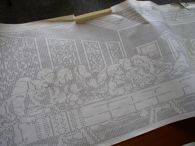
Collies are usually viewed on a computer screen, but I wanted to materialize my product into a physical form. This seemed like a challenging task, as collies are typically continuous, spanning several pages in length, making them difficult to sensibly present, for example, on the pages of a book.
I came up with the idea to print my Amiga ASCII images using a dot-matrix printer. It can print on continuous form paper, which modern printers cannot do. Continuous form paper is a continuous strip of paper perforated at regular intervals. Dot-matrix printers were common in the 80s and 90s before the advent of proper inkjet and laser printers. In a dot-matrix printer, graphics are printed as dots by striking pins against a black ribbon onto the paper. This was perfect for my purpose, as my images are black and white and would cover several vertical A4 pages in total. As the device was popular around the same time Amiga ASCII was most commonly produced, it also served as a fitting historical reference.
However, I don't own such a device, and according to a Facebook poll, none of my acquaintances did either. The device seemed to be outdated technology that no one had. But I didn't give up; I searched for "dot matrix printer" in the Fonecta search service. The search yielded only one result: the printer-manufacturing company, OKI Finland. I emailed them, asking if they knew where I could borrow a dot-matrix printer. Fortunately, and to my surprise, they had one to lend, which I borrowed for a month.

However, my luck changed when, upon testing the printer's features, I found out that it was not possible to print a completely continuous image. The printout of my production turned out to be over 5 meters long, and the printer left a margin of about a centimeter every 30 centimeters or so. This is due to the printer's drivers, which were not designed for long print runs, even if it would be theoretically possible. Nevertheless, I didn't let this discourage me, as the idea of the production still comes through despite this.
Note from 2023:
I did manage to print it as a "continuous" image by printing one section at a time and then carefully positioning the paper again.
CONCLUDING REMARKS
The aim of the project was to explore Amiga ASCII culture, learn to observe forms, typography, and textures in a new way, enhance my creative expression, and gather insights for graphic design.
Amiga ASCII significantly resembles graphic design. It is used to embellish user interfaces, create logos for clients, and typographic design lies at its core. However, I don't feel that I've gained any practical benefit as a graphic designer from this project. The method of Amiga ASCII is unique, and it has no practical link to today's world. It's hard to instrumentalize. It operates under its own rules, in the margin, outside the mainstream. It is anti-capitalist, even anarchistic, because it is difficult to commercialize or display in art galleries. It can be described as digital folk art or tradition. It pales in expressive power compared to many other art methods. Yet, it's alluring, charming, and delightful because of its peculiar nature.
I don’t see that I have developed as a designer, but I feel I have gained immensely from the project. I am pleased to have been introduced to such an interesting topic. In my view, I have provided a comprehensive description of the subject. I feel proud to have learned a skill that many people I know had never even heard of, and in that respect, my goal was met: I developed my creative expression. However, I only scratched the surface and see a lot of potential in the method. I definitely intend to continue creating Amiga ASCII art. It would also be great if my project helped me become part of the Amiga ASCII community.
As Matt “mattmatthew” Yee states in a Blocktronics interview:
"The works done by new and old artists these days are probably the best the scene has ever seen, with a few exceptions. My peers have developed this method further than it has ever been developed before. This is an exciting time to draw." [61]
I look forward to following the development of Amiga ASCII art.
Note from 2023:
8 years later, I must say doing this thesis was a real turning point for me! It's difficult to put into words how and how much it benefitted me as a graphic designer or as a person, but as text art is still at the core of my practice, I would say a lot. The "practical" use of Amiga ASCII has mainly come from learning and understanding the modular process of image making, which has enabled me to develop various modular design tools that I've used in my profession as a graphic designer. Even so much that I rarely use any Adobe software anymore.
I did join the Amiga ASCII community shortly after releasing my thesis, by joining the "Impure!ASCII 1940" group. In 2021 I collaborated with them by making an 8 minute long train ride animation that even won the PC Demo compo at Flashparty 2021. I'm really happy how it turned out!
Even though it's been 8 years, I still feel like I've only scratched the surface of the potential in the method. I don't see myself stopping anytime soon.
SOURCES
5.1. PRINTED SOURCES
- Bann, Stephen (1967): Concrete poetry. An international anthology, Lontoo: London Magazine editions.
- Coulmas, Florian (1999): The Blackwell Encyclopedia of Writing Systems. John Wiley & Sons Ltd.
- Halliday, M.A.K ja Hasan. R (1976): Cohesion in English. Longman.
- Jäntti, Yrjö (1940): Kirjapainotaidon historia. WSOY.
- MikroBitti-magazine 6–7/1992
- Tullett, Barrie (2014): Typewriter art: a modern anthology. Lontoo: Laurence King Publishing.
5.2. UNPRINTED SOURCES
5.2.1 INTERNET-SOURCES
- Amiga History Guide (2003): The Twists and Turns of the Amiga Saga. WWW-page. < http://www.amigahistory.co.uk/ahistory.html >
- ASA (1963): American Standard Code for Information Interchange. ASA X3.4–1963 < http://www.worldpowersystems.com/projects/codes/X3.4-1963/index.html > 10.4.2015.
- BYTE-magazine (5/1977): System description, The Apple-II. < https://archive.org/stream/byte-magazine-1977-05/1977_05_BYTE_02-05_Interfacing#page/n35/mode/2up > 10.4.2015.
- Carlsson, Anders & Miller, Bill (2012): Future Potentials for ASCII art. Goto80 WWW-page. < http://goto80.com/chipflip/06/ > 10.4.2015.
- Dubost, Karl (2008): UTF-8 Growth On The Web. W3C Blog. World Wide Web Consortium. < http://www.w3.org/blog/2008/05/utf8-web-growth/ > 10.4.2015.
- Elmansy, Rafiq (2014): Taking A Closer Look At Arabic Calligraphy. Smashing Magazine WWW-page. < http://www.smashingmagazine.com/2014/03/20/taking-a-closer-look-at-arabic-calligraphy/ >
- Hargadon, Michael (2011): Like City Lights, Receding: ANSi Artwork and the Digital Underground 1985-2000. Masters thesis, Concordia University. < http://spectrum.library.concordia.ca/7341/1/Hargadon_MA_S2011.pdf >. 10.4.2015.
- Hertzen, Gustav von (2007): Demokratian haaste. Gummerus. < https://gustavhertzen.files.wordpress.com/2011/01/demokratian-haaste-kirja.pdf > 10.4.2015.
- Hirvonen, Mikko (2010): BBS-harrastajat 1990-luvun tietoverkkokulttuurin murrosvaiheessa – näkökulmia Internetin kulttuuriseen omaksumiseen. Turku: Turun yliopisto. < http://users.utu.fi/petsaari/tutkimukset/gradu 12.04.2010.pdf > 10.4.2015.
- Holler, Richard (1994): FILEID.TXT v1.9. Textfiles WWW-page. < http://www.textfiles.com/computers/fileid.txt > 10.4.2015.
- Karaiste, Mikko (2008): Amigaskene, alakulttuuri tietokoneen puitteissa: kuvauksia alakulttuurin ja teknologioiden yhteenkietoutumisesta. Jyväskylä: Jyväskylän yliopisto. < https://jyx.jyu.fi/dspace/handle/123456789/38191 > 10.4.2015.
- Knowlton, Ken (2005): Mosaic Portraits: New Methods and Strategies. YLEM Journal, Jan/Feb 2005 25 No. 2 < http://computer-arts-society.com/uploads/page59.pdf > 10.4.2015.
- Korpela Jukka (2001): A tutorial on character code issues. IT and communication. WWW-page. < http://www.cs.tut.fi/~jkorpela/chars.html#more > 10.4.2015.
- Popova, Maria (2014): A Visual History of Typewriter Art from 1893 to Today. WWW-page. < http://www.brainpickings.org/2014/05/23/typewriter-art-laurence-king > 10.4.2015.
- Reunanen, Markku (2010): Computer Demos – What Makes Them Tick? Helsinki: Aalto University School of Science and Technology. < http://www.kameli.net/demoresearch2/reunanen-licthesis.pdf > 10.4.2015.
- Reunanen, Markku (2013): Neljän kilotavun taide. WiderScreen 2–3/2013. WWW-page. < http://widerscreen.fi/numerot/2013-2-3/neljan-kilotavun-taide/ > 10.4.2015.
- Victoria and Albert Museum: A History of Computer Art. WWW-page. < http://www.vam.ac.uk/content/articles/a/computer-art-history/ > 10.4.2015.
- Wikipedia: ASCII < http://en.wikipedia.org/wiki/ASCII > 10.4.2015.
- Wolfers, Danny (2014): ORDER OF THE SHADOW WOLF. E-ZiNe Issue #1 1/2014 < http://www.legowelt.org/shadowwolfissue1.html > 10.4.2015.
- Yee, Matt (2015): Interview with mattmatthew. Blocktronics blog. < http://blocktronics.tumblr.com/post/112450171273/anyone-already-familiar-with-blocktronics > 10.4.2015.
5.2.2. DOCUMENTARIES
- Scott, Jason (2005): BBS The.Documentary Part 1 - Baud. 9:00. < https://www.youtube.com/watch?v=JnSz-Hb9LQY > 10.4.2015.
- Scott, Jason (2005): BBS Documentary Interview Collection: John Sheetz. < https://archive.org/details/20030322-bbs-sheetz > 10.4.2015.
5.2.3. INTERVIEWS
- Kiuru, Antti (2015): Interviewed in person. Helsinki. 5.4.2015.
- Hischer, Michael (2015): Interviewed through email. 18.3.2015.
5.3. IMAGE SOURCES
- Figure 1. Lotvonen, Heikki (2015).
- Figure 2. Macpuerto (2013): Caligramas. Image from the WWW-page. < http://macpuerto.com/wp-content/uploads/2013/12/03_simmias_rodas.jpg > 10.4.2015.
- Figure 3. Tullett, Barrie (2014): Typewriter art: a modern anthology. London: Laurence King Publishing. Scanned 10.4.2015.
- Figure 4. Tullett, Barrie (2014): Typewriter art: a modern anthology. London: Laurence King Publishing. Scanned 10.4.2015.
- Figure 5. Scott, Jason (2005): Images from John Sheetz interview. Image from the WWW-page. < http://www.bbsdocumentary.com/photos/099sheetz/M/p1010032.jpg > 10.4.2015.
- Figure 6. Lotvonen, Heikki (2015).
- Figure 7. Knowlton, Ken (1966): Ken Knowlton Mosaics. Image from the WWW-page. < http://www.knowltonmosaics.com/pages/HKnewd.htm > 10.4.2015.
- Figure 8. Lotvonen, Heikki (2015).
- Figure 9. Lotvonen, Heikki (2015).
- Figure 10. Lotvonen, Heikki (2015).
- Figure 11. cwilson5603 (2008): Last Callers Screen. Image from Flickr. < https://www.flickr.com/photos/22767465@N05/2732637059/ > 10.4.2015.
- Figure 12. Lotvonen, Heikki (2015).
- Figure 13. Zeus (2014): zeitgeist|moving|on. Image from the WWW-page. < http://amiga.textmod.es/colly/se-zeit/ > 10.4.2015.
- Figure 14. Kiuru, Antti (2015): Jungle Fever. Image from the WWW-page. < http://amiga.textmod.es/colly/ds!-jufv/ > 10.4.2015.
- Figure 15. Kiuru, Antti (2015): Jungle Fever. Image from the WWW-page. < http://amiga.textmod.es/colly/ds!-jufv/ > 10.4.2015.
- Figure 16. Zeus (2014): zeitgeist|moving|on. Image from the WWW-page.< http://amiga.textmod.es/colly/se-zeit/ > 10.4.2015.
- Figure 17. Break_06 (2014): FILE_ID.DIZ. Image from the WWW-page. < http://sixteencolors.net/pack/break_06/FILE_ID.DIZ > 10.4.2015.
- Figure 18. Lotvonen, Heikki (2015).
- Figure 19. Lotvonen, Heikki (2015).
- Figure 20. Lotvonen, Heikki (2015).
- Figure 21. Lotvonen, Heikki (2015).
- Figure 22. Lotvonen, Heikki (2015).
FONT USED IN PRODUCTION
“ttf version of TopazPlus” by dMG/t!s^dS! is licensed under CC BY-NC-SA 3.0.0 < http://www.trueschool.se/html/t!s-af10.readme.html > 10.4.2015.
Tullett 2014, p. 20 ↩︎
Tullett 2014, p. 47 ↩︎
Halliday & Hasan 1976, 1–2 ↩︎
Coulmas 1999, 12 ↩︎
Carlsson & Miller 2012, online source ↩︎
Elmansy 2014, online source ↩︎
Jäntti 1940, 35 ↩︎
Tullett 2014, 9 ↩︎
Popova 2014, online source ↩︎
Bann 1967, 20. ↩︎
Carlsson & Miller 2012, online source ↩︎
Scott 2005, documentary ↩︎
Hargadon 2011, 35–38 ↩︎
Hargadon 2011, 44 ↩︎
Hargadon 2011, 45 ↩︎
BYTE magazine 5/1977, 34 ↩︎
Hargadon 2011, 47-48 ↩︎
MikroBitti 6–7/1992, 7 ↩︎
Amiga History Guide, online source ↩︎
Amiga History Guide, online source ↩︎
Hertzen 2007, 263 ↩︎
ASA 1963, online source ↩︎
ASCII, Wikipedia http://en.wikipedia.org/wiki/ASCII ↩︎
Korpela 2001, online source ↩︎
Dubost 2008, online source ↩︎
Carlsson & Miller 2012, online source ↩︎
Carlsson & Miller 2012, online source ↩︎
Victoria and Albert Museum, online source ↩︎
Knowlton 2005, online source ↩︎
Victoria and Albert Museum, online source ↩︎
Carlsson & Miller, online source ↩︎
Hischer 2015, interview ↩︎
Reunanen 2013, online source ↩︎
Karaiste 2008, 34 ↩︎
Kiuru 2015, interview ↩︎
Hirvonen 2010, 11 ↩︎
Scott 2005, documentary ↩︎
Hirvonen 2010, 22 ↩︎
Hirvonen 2010, 31 ↩︎
Karaiste 2008, 41 ↩︎
Hirvonen 2010, 112 ↩︎
Reunanen 2010, 77 ↩︎
Hargadon 2011, 100 ↩︎
A crack intro is the welcome view of a cracked computer program that contains messages to other hacker groups. ↩︎
Kiuru 2015, interview ↩︎
Kiuru 2015, interview ↩︎
Kiuru 2015, interview ↩︎
Kiuru 2015, interview ↩︎
Hirvonen 2010, p. 23 ↩︎
Holler 1994, online source ↩︎
Hargadon 2011, p. 163 ↩︎
Kiuru 2015, interview ↩︎
Wolfers 2014, online source ↩︎
Hischer 2015, interview ↩︎
Link: PabloDraw http://picoe.ca/products/pablodraw/ ↩︎
Yee 2015, online source. ↩︎